.png)
Web Design
UI/UX Design
Black-Owned Nashville
Year
2021
Location
Nashville, TN
Design Tools
Figma, Illustrator, Photoshop
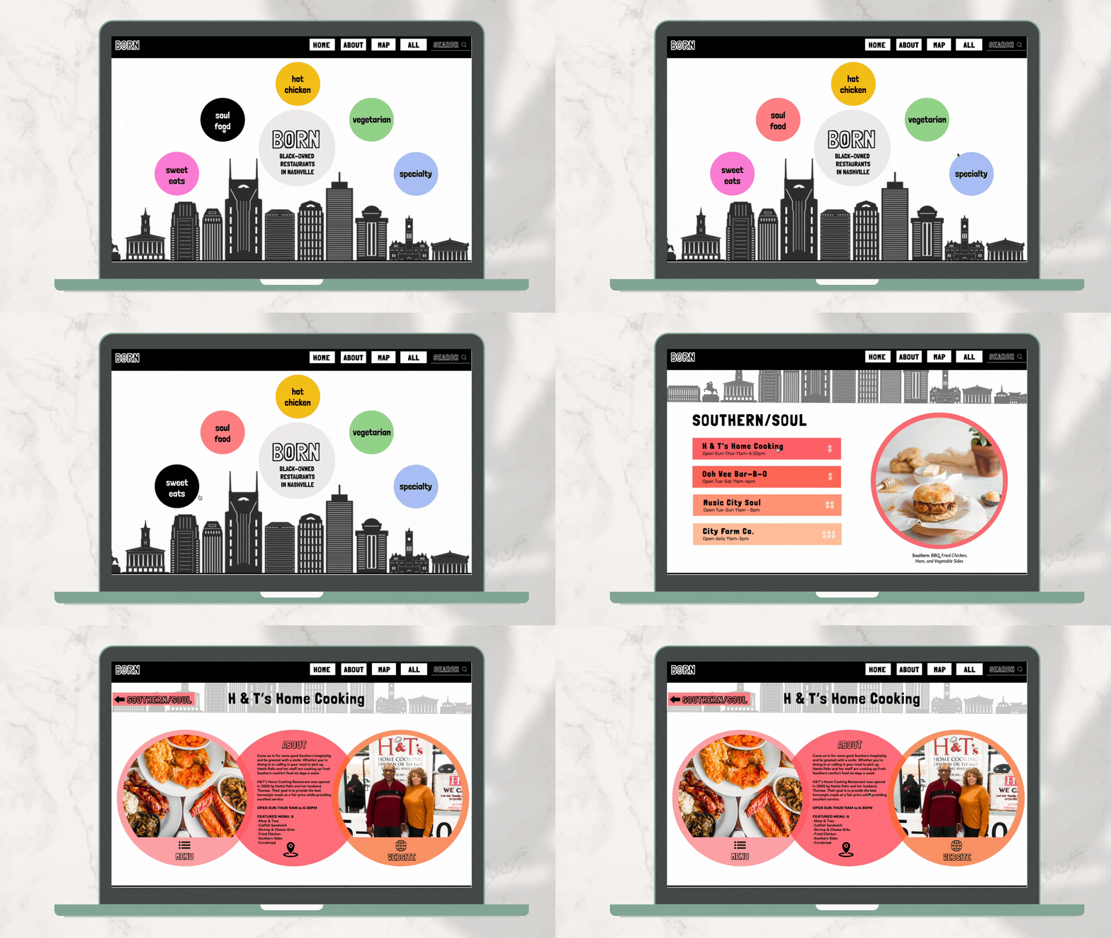
Created a responsive prototype of a website that displays an archive of content (Black-Owned Nashville Restaurants), and tracked the design process from research through design proof-of-concept through a final case study presentation.

Process
The Goal: Support and Design Consciously
My goal of this website was to list black-owned restaurants, but also tell some of its story when doing so. Encouraging people to spend their money at black-owned restaurants seems like a direct way to effect change under capitalism, given the historic and systemic lack of resources afforded to black communities and black business owners. Dining at black businesses does not reduce police brutality or address inherently racist institutions. Yet, the fact that this website exists explicitly shows that the majority of restaurants we eat at are white-owned. That’s a problem. This is a way to shift conscious thought into spending power and who consumers actively seek to support.
Design-wise, I wanted to explore how the web interface could serve as an aggregator for vast amounts of material, while using a well-designed logic and structure as an opportunity for implicit engagement and communication. The primary objective was to design my site in a way that made it clear to the user what the purpose of the site was, that the navigation and usability was clear, and that supporting information supplemented the image archive.


Step 1: Field Research & Inventory
First, I selected my site topic and researched the subject before gathering all the content I would use in the site and assembled it in a clearly organized proposal.


Step 2: Content Architecture and Wireframes
Now that I had my information, I had to orchestrate a non-linear user experience. In order to visualize different ways to approach the structure of your site, I went through a combination of hand-drawn sketches, lo-fi prototypes, and pushed them to hi-fi prototypes before conducting some user testing.


Step 3: Visual Design & Hierarchy
To translate my wireframe fully into design I needed to develop and evaluate directions for the visual language of your site, such as the fitting color palette, typographic style, image quality, and hover states or other interactive elements. After conducting user testing with my peers, I was able to refine my design language.

Step 4: User Testing & Final Prototype
Once my design direction was finalized, I applied the design system and its components to the homepage and 10 interior pages. Knowing there were different food categories such as "Southern", "Vegetarian", and "Sweet Eats", I noted that the design system needed to shift or modulate to indicate a user's location within the site. Thus, by using different colors from the base monochromatic color scheme I aimed to cue the user that they are in a new "place" moving from home to interior pages. Finally, I applied basic connections / transitions to make this a functioning prototype that demonstrated the scope of my site.
Responding to user feedback, I placed emphasis on making a clearly outlined structure for the visual components of my system, and then using character and other styles to maintain continuity.
